
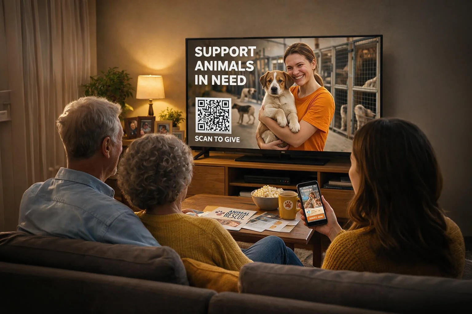
Picture this: a potential donor is watching TV, and your nonprofit’s Connected TV (CTV) ad catches their attention. They're moved. They grab their phone, scan the QR code on screen, and land on a clunky, slow-loading page that makes them squint and zoom just to find the donate button. They bounce, and that expensive ad spend just went to waste.
CTV fundraising only works if the landing page matches the moment. That starts with a strong nonprofit marketing plan that accounts for how and where donors actually engage, including on their phones, mid-commercial break. Below, we'll walk through how to design a landing page that meets that couch-bound donor exactly where they are, phone in hand, show still playing in the background.
Understand the Second-Screen Donor Mindset
A CTV donor isn't thinking like someone who found your nonprofit through a Google search. The average searcher is often deliberate. They compare charities, read your mission statement, and take their time. The CTV donor is different. They're acting on impulse, sparked by a 15- or 30-second commercial that hit an emotional nerve.
That impulse comes with a catch: the viewer's attention is split. Part of their brain is still tracking the show's dialogue or waiting for the commercial break to end while the other part is trying to navigate your landing page on a small screen, with their thumb, probably from a couch. If your page requires any real thinking, you've likely lost them. Here are a few behavioral hurdles worth planning around:
The commercial break clock. Viewers often want to finish giving before their show comes back on.
High abandonment risk. A fragmented attention span means any friction, such as a slow load or a confusing form, can send them right back to the couch cushions.
Low tolerance for reading. With one ear still focused on the television, they won't read paragraphs of text. They'll skim, or they'll leave.
To overcome these hurdles, your mobile donation page must be streamlined to require zero cognitive effort. This way, you can convert that emotional impulse into a completed gift before their show resumes.
Design Mobile-First Landing Pages
Once you understand the mindset, the design choices become much clearer. Everything should be built for a thumb, not a mouse.
Responsive design matters here more than almost anywhere else in your nonprofit's digital presence. If a donor has to pinch, pan, or zoom to read your appeal, you've already made the page harder to use than it needs to be. Follow a few technical tips:
Compress images and cut unnecessary scripts so the page loads fast.
Keep your primary call to action above the fold. No scrolling required to find the donate button.
Stick to a single-column layout. Distracted users shouldn't have to hunt for the next step.
Mobile-first design isn't unique to CTV landing pages. It's a good practice across all of your nonprofit campaigns, especially any that rely on paid traffic where every second of load time affects conversion.
Eliminate Friction With Streamlined Forms
A donor relaxing on their couch probably isn't going to pause their show, dig through a purse or wallet for a physical credit card, and fill out a ten-field form. If your donation form asks for more than the essentials, expect people to give up halfway through.
Keep the form lean:
Add mobile wallet options like Apple Pay or Google Pay so donors can give without typing card numbers.
Limit fields to what you truly need: name, email, gift amount, and payment information.
Offer preset donation tiers ($25, $50, $100) to cut down on decision fatigue, and consider displaying slightly lower default amounts ($10, $20, $30) if the user toggles to a recurring option.
Include one clear, high-visibility checkbox for making the gift recurring.
Meyer Partners' monthly giving guide recommends giving donors a simple choice between "Give Once" or "Give Monthly," and being upfront that the recurring option will automatically process payments each month. That kind of clarity builds trust, which matters even more when someone is giving in the middle of a commercial break.
Maintain Visual and Messaging Continuity
If your commercial features a specific rescue dog, a family you helped, or any individual with a name and a story, your landing page should feature that same face. This is called an ad-to-page match, and it reassures the donor that they landed in the right place.
Your headline should also echo the specific language from the commercial. If the ad says "help feed a family this winter," your landing page headline shouldn't say something entirely different, like "support our mission." Consistency builds confidence fast, which is exactly what a second-screen donor needs.
A few trust-building elements to include:
Campaign-specific, emotionally resonant photography, ideally matching the ad itself.
Consistent brand colors and logo placement, so the QR code doesn't feel like it led somewhere unfamiliar or unsafe.
A short, one- or two-sentence statement on the direct impact of their gift.
This level of visual consistency and polish needs to extend beyond your landing page. If a second-screen donor decides to click around your main site and encounters broken links or outdated branding, they will likely bounce. Cornershop Creative's guide to nonprofit website maintenance breaks down how to keep your entire site running smoothly so you never lose a donor to a technical hiccup.
Track, Measure, and Attribute CTV QR Code Success
Proving ROI on a television ad is tricky. Unlike Google Ads, you can't directly track every impression back to a click. QR codes help close that gap by giving you a bridge between an offline viewing moment and an online action.
Start with the basics: send your QR code to a unique, campaign-specific URL rather than your homepage. Then layer in tracking:
UTM parameters. Append standard tags like utm_source=ctv and utm_medium=qrcode directly into the destination link.
Scan-to-land bounce rate. Compare the number of scans to actual page views. A big gap usually means your page is too slow to load.
Granular conversion metrics. Look past your overall conversion rate. Track average gift size, recurring opt-in rate, and Cost Per Acquisition (CPA) to see whether the CTV spot is actually paying off.
Tracking the right nonprofit data analytics gives you concrete evidence to determine whether your ads are a predictable, measurable engine for fundraising. And if you're still deciding whether CTV is worth the investment in the first place, AdGood's rundown of what to expect from your first CTV campaign is a good place to start.
Wrapping Up
Even the most emotionally compelling commercial falls flat if the landing page behind it is slow, inconsistent, or hard to use on a phone. Second-screen donors don't have much patience, and they shouldn't need any to give to your cause.
Before your next CTV campaign goes live, test your landing page on a few different mobile devices and screen sizes. A donor watching from their couch deserves a page that works as hard as your commercial did to earn their attention. Memorable nonprofit brands can be built on TV the same way the biggest consumer brands are, and a well-optimized landing page is what turns that attention into action.
